This entry point experience is an important moment in establishing your product’s brand and experience and sets the tone for their overall experience with the product. “Signing in” provides an authentication method to validate a user’s unique identification and allow them access to protected areas of an application. A user provides their required identification and, if correct, they are provided access to the product.
When implementing validation and security measures Astro users should consult with their organization’s IT/Security departments and adapt these patterns to suit the requirements of their organization’s best practices and security needs.
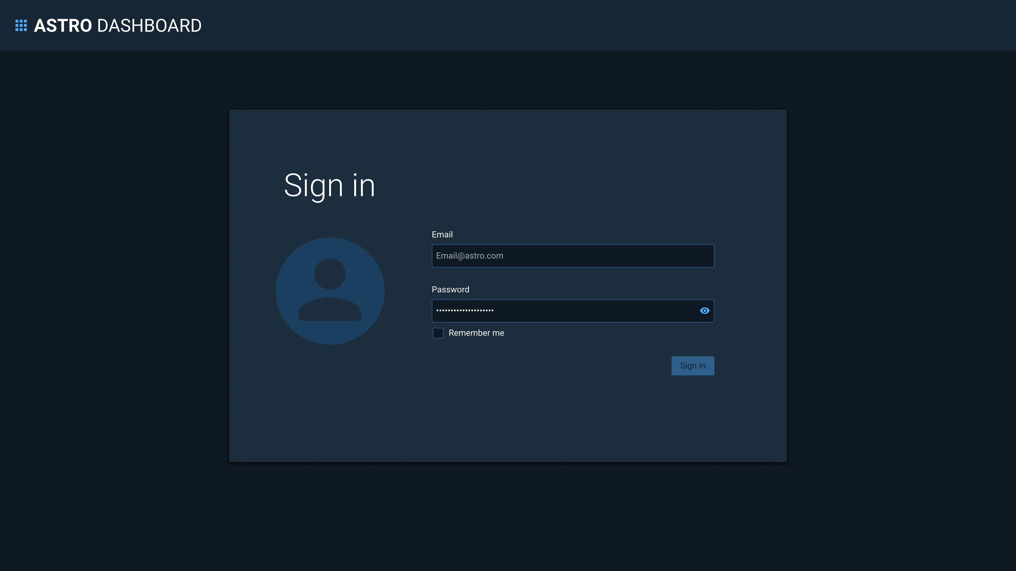
The Sign In page is presented to users in the following scenarios:
- When a user wants to gain access to an application.
- When a user has signed out voluntarily. They will see a confirmation message after which they will be automatically redirected back to the Sign In page.
- When a user has been signed out due to inactivity. In this scenario, when the user signs back in they should be redirected to the last page they were on, before being signed out.
Rules of Thumb
- Use “Sign in”, not Login, Log in or Log-in. (Note: When leaving an application, use “Sign out”, not Sign off)
- Use a direct, actionable button name, such as “Sign in”, rather than a more generic “Submit” to post the form.
- Consult with your IT/Security team to ensure you are meeting your specific authentication best practices and security needs.
- Provide a way for users to sign out and re-authenticate.
Appearance and Behavior
There are four established types of sign in workflows.
- Sign in with Username or Email Plus Password This is the most basic sign in workflow, wherein the user identifies and authenticates from the same screen using an ID and passcode.
- Sign in with Common Access Card (CAC) This sign in requires additional authentication via a CAC reader and PIN.
- Sign in with Single Sign-on (SSO) SSO allows the user to authenticate to multiple systems using one identification and passcode method.
- Sign in with Multi-Factor Authentication (MFA) MFA requires the user to set up additional methods of identification, such as a PIN, or through a verification code sent to a user’s mobile device.
The Sign In can currently be configured to display Sign in with Username or Email Plus Password, Sign in with SSO and validation.
Sign in with Username or Email Plus Password
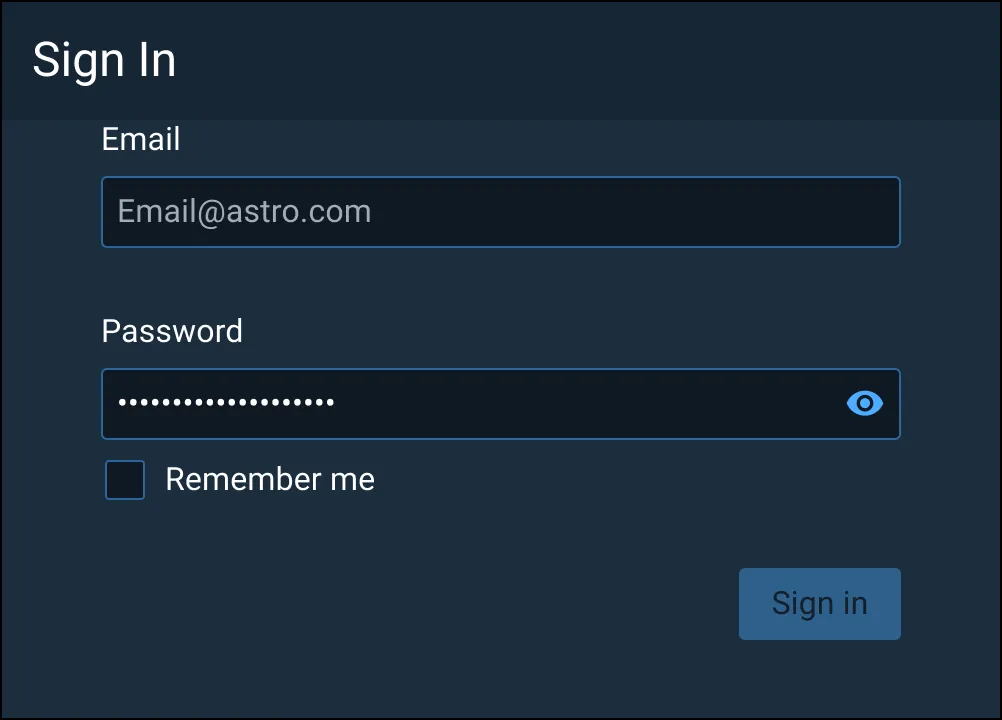
The Sign In component consists of a field to identify the user, typically a username or email, and a masked field for a unique passcode, as well as a button that submits the content.
Sign in with Single Sign-on (SSO)
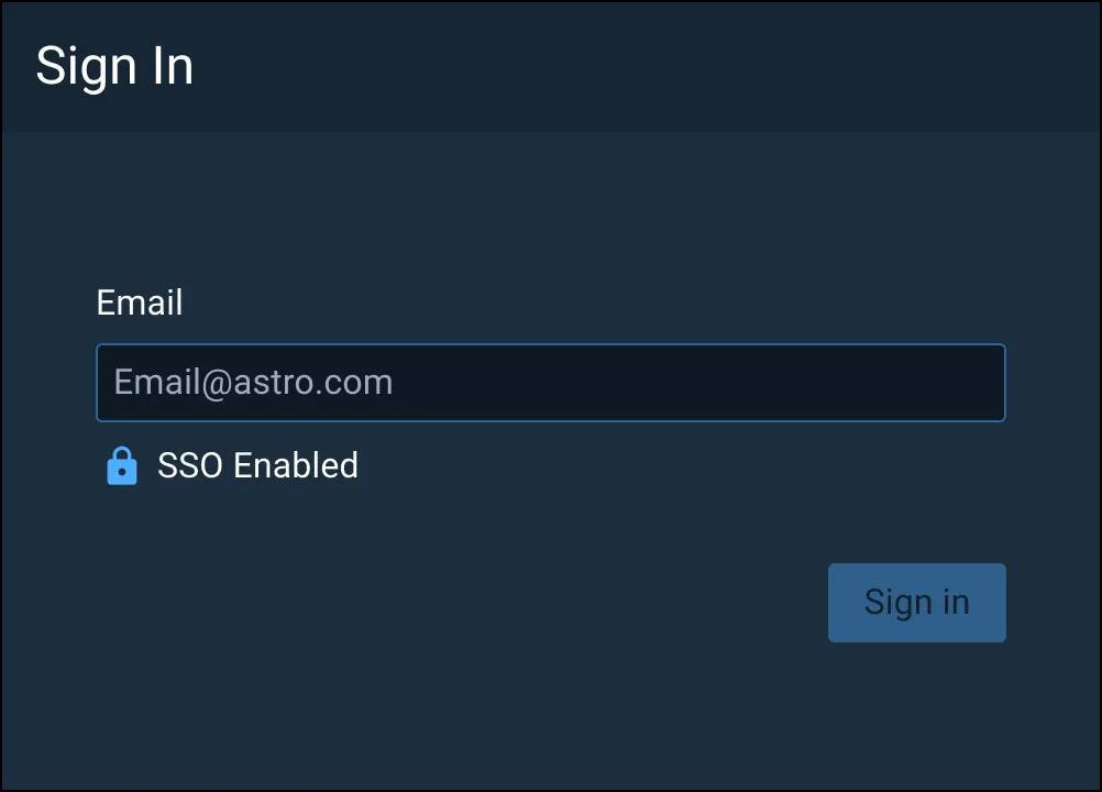
The Sign In component consists of a field to identify the user, typically a username or email, and a button that submits the content for SSO verification.
Placement
The Sign In UI elements can be added in 3 possible placement areas.
-
Modal dialog

- Draws user attention to Sign In process
- Can allow application to be running in the background when signed out
- Ideal for switching applications
-
Sidebar

- Generally placed on left side of page
- Allows imagery/branding on opposite side of page to differentiate application
- Often used alongside SSO
-
Full page

- Draws user attention to the Sign In process, without the need for a modal dialog to be placed over an essentially blank page
- Ideal for initial entry points and when the user does not have access until after authentication
Validation
Effective error messaging is important for creating great experiences. Not being able to sign into an application is frustrating and blocks users from accomplishing their tasks. Error messages should be clear and concise. They should help users understand what went wrong and give users steps to resolve the error. Be as specific as possible in your error messages Validate as much of the user’s data before submission as possible. This real-time validation should happen when the input field loses focus and checks for input errors like invalid characters and empty fields. This helps users easily identify mistakes and fix them before submitting the Sign In form. Always present error states on the Sign In screen, and use inline errors whenever possible when they do not present a security concern.
Common client-side errors:
- Empty required fields
- Invalid characters
- Incorrect input format
If there are server-side errors when the user submits the Sign In form, the page should be reloaded, the password field cleared, and the user returned to the username input field. Use an inline notification to display field-specific errors (where they do not provide a security concern) and provide clear direction on how users should resolve the issue, and a validation summary for errors that are not field-specific (such as time-outs, a server being down, or lack of connection) or for errors that apply to multiple fields and could present a security concern when inline (e.g. when the username is not found, or the password is correct they are often grouped into one error, such as “Username or password is incorrect”.)
Common server-side errors:
- Invalid authentication
- Max # of sign in attempts reached
- Account lock out
- Database or system error

Accessibility
Ensure that users can tab through the Sign In form and navigate the page using only a keyboard. Use landmark regions to designate the Sign In region and allow screen readers to skip directly to the input fields. This is especially important if you are using the split-screen layout or have additional content on the page.
Examples


Asset Status
| Asset | Version | Status |
|---|---|---|
| Documentation | N/A | Available |
| UI Kit - Dark | v7 | Available |
| UI Kit - Light | v7 | Available |
| UI Kit - Wireframe | v7 | Available |
| Web Component | N/A | Not Available |
| Component Tokens | N/A | Planned |