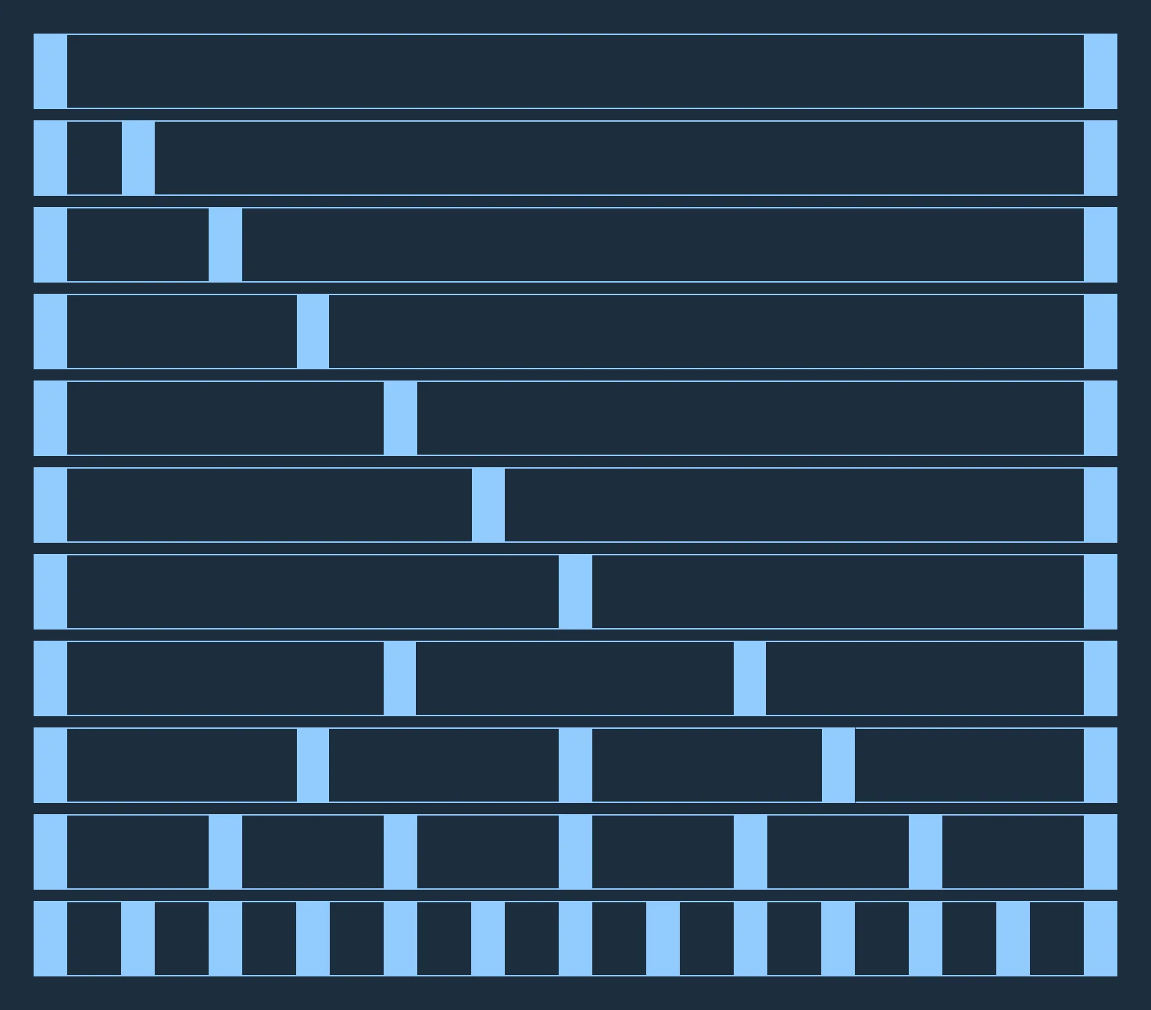
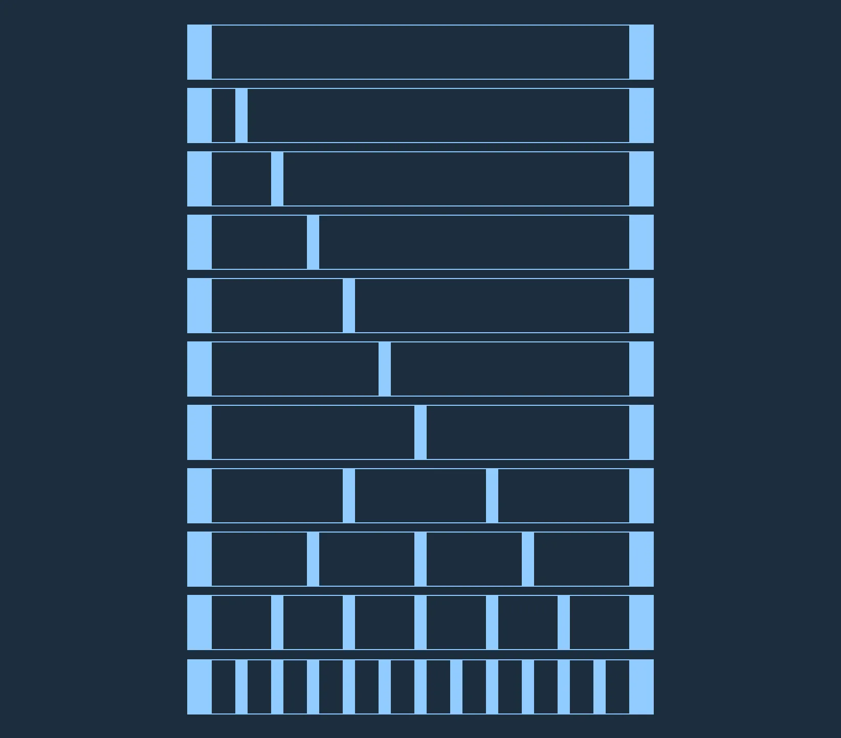
Ensuring a consistent grid system within your application and across all Astro applications creates a sense of continuity and relationship from screen to screen and app to app, even when the layouts between those screens may have dramatically different requirements.
Columns, Gutters and Margins
The Astro Grid is a standard 12 column grid with column widths that expand or contract in relation to the width of the display. Columns are separated by a fixed-width gutter. Astro-compliant applications may use gutters of either 24 pixels (default) or 12 pixels (compact). The grid is enclosed by a fixed-width margin of 24 pixels. These specifications are for screen resolutions of 769px to 1920px max width.


Breakpoints
At certain screen sizes, Astro optimizes for display on narrow devices by reducing the number of columns and rearranging the layout of your application via responsive design practices.
| Breakpoint | Columns | Margin | Gap | Gap (compact) |
|---|---|---|---|---|
| 0-360px | 4 | 16px | 16px | 8px |
| 361-768px | 8 | 24px | 24px | 12px |
| 769-1920px | 12 | 24px | 24px | 12px |
| 1921-3840px (large screens) | 12 | 48px | 48px | 24px |
4-px Grid
A 4-px horizontal grid at 1920px resolution has been provided to help designers align layouts on a 4-px system with greater precision.
CSS Grid is the recommended method for implementing a grid in your Astro project. Using a custom layout grid adds overhead and layers of incompatibility, and as such, should only be used if your project requires backwards-compatibility with Internet Explorer 9 or earlier.