Rules of Thumb
- Choose text for Links that:
- Tell the user what will happen when clicking the Link.
- Hint at the deeper content the Link will reveal.
- Keep the text for Links short. Short Links are more visually scannable.
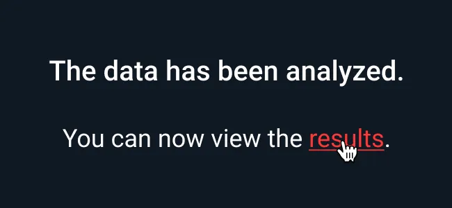
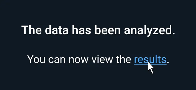
- Links are to be styled in the Astro-defined primary interactive color.
- Hovered links are to be styled in the same primary interactive color accompanied by an underline.
- Un-clicked or un-hovered links have no underline.
- Inline and standalone links are to be styled the same way.
- Underlines for hover state are not needed for other elements like tabs, buttons, and pop up menus. However the link hover pattern with underlines are present on hovered pagination.
- Link-styled icons do not have the underline unless they’re part of an inline text link. Without text, follow button guidance (no underline on hover).
Avoid using “Click Here” or “Link” for the link text.
Appearance and Behavior
Links
Inline and standalone links are to be styled the same way, with the primary blue (--color-palette-brightblue-500) for normal links and hover (--color-palette-brightblue-400) accompanied by an underline for links in hover state.
Underlines can be applied by detaching the text style and selecting the three dots to access further text options, and selecting the underline setting within. This is a less than satisfactory but temporary fix.
Examples


Asset Status
| Asset | Version | Status |
|---|---|---|
| Documentation | N/A | Available |
| UI Kit - Dark | v7 | Available |
| UI Kit - Light | v7 | Available |
| UI Kit - Wireframe | v7 | Available |
| Web Component | N/A | Not Available |
| Component Tokens | N/A | Planned |
Status Key
AvailableIn ProgressPlannedNot AvailableDeprecated